- Data Professor
- Posts
- How to Build a Regression Model in Python
How to Build a Regression Model in Python
A Detailed and Visual Step-by-Step Walkthrough
Chanin Nantasenamat
August 16, 2020

If you are an aspiring data scientist or a veteran data scientist, this article is for you! In this article, we will be building a simple regression model in Python. To spice things up a bit, we will not be using the widely popular and ubiquitous Boston Housing dataset but instead, we will be using a simple Bioinformatics dataset. Particularly, we will be using the Delaney Solubility dataset that represents an important physicochemical property in computational drug discovery.
The aspiring data scientist will find the step-by-step tutorial particularly accessible while the veteran data scientist may want to find a new challenging dataset for which to try out their state-of-the-art machine learning algorithm or workflow.
1. What we are Building Today?
A regression model! And we are going to use Python to do that. While we’re at it, we are going to use a bioinformatics dataset (technically, it’s cheminformatics dataset) for the model building.
Particularly, we are going to predict the LogS value which is the aqueous solubility of small molecules. The aqueous solubility value is a relative measure of the ability of a molecule to be soluble in water. It is an important physicochemical property of effective drugs.
What better way to get acquainted with the concept of what we are building today than a cartoon illustration!
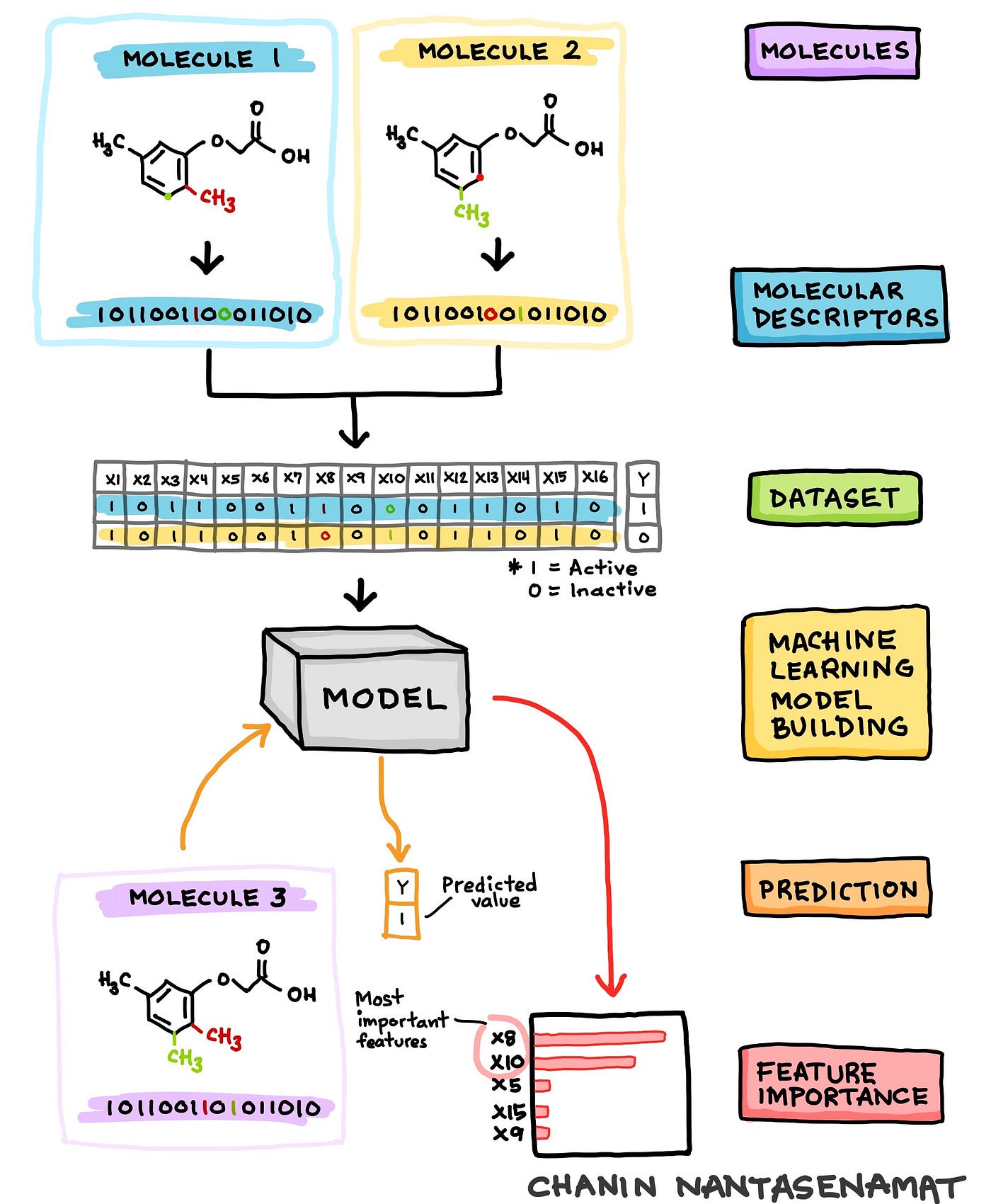
Cartoon illustration of the schematic workflow of machine learning model building of the cheminformatics dataset where the target response variable is predicted as a function of input molecular features. Technically, this procedure is known as quantitative structure-activity relationship (QSAR). (Drawn by Chanin Nantasenamat
2. Delaney Solubility Dataset
2.1. Data Understanding
As the name implies, the Delaney solubility dataset is comprised of the aqueous solubility values along with their corresponding chemical structure for a set of 1,144 molecules. For those, outside the field of biology there are some terms that we will spend some time on clarifying.
Molecules or sometimes referred to as small molecules or compounds are chemical entities that are made up of atoms. Let’s use some analogy here and let’s think of atoms as being equivalent to Lego blocks where 1 atom being 1 Lego block. When we use several Lego blocks to build something whether it be a house, a car or some abstract entity; such constructed entities are comparable to molecules. Thus, we can refer to the specific arrangement and connectivity of atoms to form a molecule as the chemical structure.

Analogy of the construction of molecules to Lego blocks. This yellow house is from Lego 10703 Creative Builder Box. (Drawn by Chanin Nantasenamat)
So how does each of the entities that you are building differ? Well, they differ by the spatial connectivity of the blocks (i.e. how the individual blocks are connected). In chemical terms, each molecules differ by their chemical structures. Thus, if you alter the connectivity of the blocks, consequently you would have effectively altered the entity that you are building. For molecules, if atom types (e.g. carbon, oxygen, nitrogen, sulfur, phosphorus, fluorine, chlorine, etc.) or groups of atoms (e.g. hydroxy, methoxy, carboxy, ether, etc.) are altered then the molecules would also be altered consequently becoming a new chemical entity (i.e. that is a new molecule is produced).
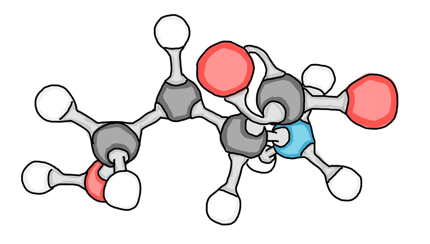
Cartoon illustration of a molecular model. Red, blue, dark gray and white represents oxygen, nitrogen, carbon and hydrogen atoms while the light gray connecting the atoms are the bonds. Each atoms can be comparable to a Lego block. The constructed molecule shown above is comparable to a constructed Lego entity (such as the yellow house shown above in this article). (Drawn by Chanin Nantasenamat)
To become an effective drug, molecules will need to be uptake and distributed in the human body and such property is directly governed by the aqueous solubility. Solubility is an important property that researchers take into consideration in the design and development of therapeutic drugs. Thus, a potent drug that is unable to reach the desired destination target owing to its poor solubility would be a poor drug candidate.
2.2. Retrieving the Dataset
The aqueous solubility dataset as performed by Delaney in the research paper entitled ESOL: Estimating Aqueous Solubility Directly from Molecular Structure is available as a Supplementary file. For your convenience, we have also downloaded the entire Delaney solubility dataset and made it available on the Data Professor GitHub.
Compound ID,measured log(solubility:mol/L),ESOL predicted log(solubility:mol/L),SMILES
"1,1,1,2-Tetrachloroethane",-2.18,-2.794,ClCC(Cl)(Cl)Cl
"1,1,1-Trichloroethane",-2,-2.232,CC(Cl)(Cl)Cl
"1,1,2,2-Tetrachloroethane",-1.74,-2.549,ClC(Cl)C(Cl)Cl
"1,1,2-Trichloroethane",-1.48,-1.961,ClCC(Cl)Cl
"1,1,2-Trichlorotrifluoroethane",-3.04,-3.077,FC(F)(Cl)C(F)(Cl)Cl
Code Practice
Let’s get started, shall we?
Fire up Google Colab or your Jupyter Notebook and run the following code cells.
import pandas as pd

delaney_url = 'https://raw.githubusercontent.com/dataprofessor/data/master/delaney.csv'
delaney_df = pd.read_csv(delaney_url)
delaney_df
Code Practice
Let’s now go over what each code cells mean.
The first code cell,
As the code literally says, we are going to import the
pandaslibrary aspd.
The second code cell:
Assigns the URL where the Delaney solubility dataset resides to the
delaney_urlvariable.Reads in the Delaney solubility dataset via the
pd.read_csv()function and assigns the resulting dataframe to thedelaney_dfvariable.Calls the
delaney_dfvariable to return the output value that essentially prints out a dataframe containing the following 4 columns:
Compound ID — Names of the compounds.
measured log(solubility:mol/L) — The experimental aqueous solubility values as reported in the original research article by Delaney.
ESOL predicted log(solubility:mol/L) — Predicted aqueous solubility values as reported in the original research article by Delaney.
SMILES — A 1-dimensional encoding of the chemical structure information
2.3. Calculating the Molecular Descriptors
A point it note is that the above dataset as originally provided by the authors is not yet useable out of the box. Particularly, we will have to use the SMILES notation to calculate the molecular descriptors via the rdkit Python library as demonstrated in a step-by-step manner in a previous Medium article (How to Use Machine Learning for Drug Discovery).
It should be noted that the SMILES notation is a one-dimensional depiction of the chemical structure information of the molecules. Molecular descriptors are quantitative or qualitative description of the unique physicochemical properties of molecules.
Let’s think of molecular descriptors as a way to uniquely represent the molecules in numerical form that can be understood by machine learning algorithms to learn from, make predictions and provide useful knowledge on the structure-activity relationship. As previously noted, the specific arrangement and connectivity of atoms produce different chemical structures that consequently dictates the resulting activity that they will produce. Such notion is known as structure-activity relationship.
The processed version of the dataset containing the calculated molecular descriptors along with their corresponding response variable (logS) is shown below. This processed dataset is now ready to be used for machine learning model building whereby the first 4 variables can be used as the X variables and the logS variables can be used as the Y variable.
MolLogP,MolWt,NumRotatableBonds,AromaticProportion,logS
2.5954000000000006,167.85,0.0,0.0,-2.18
2.376500000000001,133.405,0.0,0.0,-2.0
2.5938,167.85,1.0,0.0,-1.74
2.0289,133.405,1.0,0.0,-1.48
2.9189,187.37500000000003,1.0,0.0,-3.04
Preview of the processed version of the Delaney solubility dataset. Essentially, the SMILES notation from the raw version was used as input to compute the 4 molecular descriptors as described in detail in a previous Medium article and YouTube video. The full version is available on the Data Professor GitHub.
A quick description of the 4 molecular descriptors and response variable is provided below:
cLogP — Octanol-water partition coefficient
MW — Molecular weight
RB —Number of rotatable bonds
AP—Aromatic proportion = number of aromatic atoms / total number of heavy atoms
LogS — Log of the aqueous solubility
Code Practice
Let’s continue by reading in the CSV file that contains the calculated molecular descriptors.
delaney_descriptors_url = 'https://raw.githubusercontent.com/dataprofessor/data/master/delaney_solubility_with_descriptors.csv'
delaney_descriptors_df = pd.read_csv(delaney_descriptors_url)
delaney_descriptors_df
Code Explanation
Let’s now go over what the code cells mean.
Assigns the URL where the Delaney solubility dataset (with calculated descriptors) resides to the
delaney_urlvariable.Reads in the Delaney solubility dataset (with calculated descriptors) via the
pd.read_csv()function and assigns the resulting dataframe to thedelaney_descriptors_dfvariable.Calls the
delaney_descriptors_dfvariable to return the output value that essentially prints out a dataframe containing the following 5 columns:
MolLogP
MolWt
NumRotatableBonds
AromaticProportion
logS
The first 4 columns are molecular descriptors computed using the rdkit Python library. The fifth column is the response variable logS.
3. Data Preparation
3.1. Separating the data as X and Y variables
In building a machine learning model using the scikit-learn library, we would need to separate the dataset into the input features (the X variables) and the target response variable (the Y variable).
Code Practice
Follow along and implement the following 2 code cells to separate the dataset contained with the delaney_descriptors_df dataframe to X and Y subsets.
X = delaney_descriptors_df.drop('logS', axis=1)
X
Y = delaney_descriptors_df.logS
Y
CODE EXPLANATION
Let’s take a look at the 2 code cells.
First code cell:
Here we are using the drop() function to specifically ‘drop’ the logS variable (which is the Y variable and we will be dealing with it in the next code cell). As a result, we will have 4 remaining variables which are assigned to the X dataframe. Particularly, we apply the
drop()function to thedelaney_descriptors_dfdataframe as indelaney_descriptors_df.drop(‘logS’, axis=1)where the first input argument is the specific column that we want to drop and the second input argument ofaxis=1specifies that the first input argument is a column.
Second code cell:
Here we select a single column (the ‘logS’ column) from the
delaney_descriptors_dfdataframe viadelaney_descriptors_df.logSand assigning this to the Y variable.
3.2. Data splitting
In evaluating the model performance, the standard practice is to split the dataset into 2 (or more partitions) partitions and here we will be using the 80/20 split ratio whereby the 80% subset will be used as the train set and the 20% subset the test set. As scikit-learn requires that the data be further separated to their X and Y components, the train_test_split() function can readily perform the above-mentioned task.
Code Practice
Let’s implement the following 2 code cells.
from sklearn.model_selection import train_test_split

X_train, X_test, Y_train, Y_test = train_test_split(X, Y, test_size=0.2)
Code Explanation
Let’s take a look at what the code is doing.
First code cell:
Here we will be importing the
train_test_splitfrom thescikit-learn library.
Second code cell:
We start by defining the names of the 4 variables that the
train_test_split()function will generate and this includesX_train,X_test,Y_trainandY_test. The first 2 corresponds to the X dataframes for the train and test sets while the last 2 corresponds to the Y variables for the train and test sets.
4. Linear Regression Model
Now, comes the fun part and let’s build a regression model.
4.1. Training a linear regression model
Code Practice
Here, we will be using the LinearRegression() function from scikit-learn to build a model using the ordinary least squares linear regression.
from sklearn import linear_model
from sklearn.metrics import mean_squared_error, r2_score

model = linear_model.LinearRegression()
model.fit(X_train, Y_train)
Code Explanation
Let’s see what the codes are doing
First code cell:
Here we import the linear_model from the scikit-learn library
Second code cell:
We assign the
linear_model.LinearRegression()function to themodelvariable.A model is built using the command
model.fit(X_train, Y_train)whereby the model.fit() function will takeX_trainandY_trainas input arguments to build or train a model. Particularly, theX_traincontains the input features while theY_traincontains the response variable (logS).
4.2. Apply trained model to predict logS from the training and test set
As mentioned above, model.fit() trains the model and the resulting trained model is saved into the model variable.
Code Practice
We will now apply the trained model to make predictions on the training set (X_train).
Y_pred_train = model.predict(X_train)

print('Coefficients:', model.coef_)
print('Intercept:', model.intercept_)
print('Mean squared error (MSE): %.2f'
      % mean_squared_error(Y_train, Y_pred_train))
print('Coefficient of determination (R^2): %.2f'
      % r2_score(Y_train, Y_pred_train))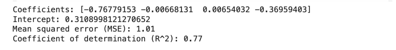
We will now apply the trained model to make predictions on the test set (X_test).
Y_pred_test = model.predict(X_test)

print('Coefficients:', model.coef_)
print('Intercept:', model.intercept_)
print('Mean squared error (MSE): %.2f'
      % mean_squared_error(Y_test, Y_pred_test))
print('Coefficient of determination (R^2): %.2f'
      % r2_score(Y_test, Y_pred_test))
Code Explanation
Let’s proceed to the explanation.
The following explanation will cover only the training set (X_train) as the exact same concept can be identically applied to the test set (X_test) by performing the following simple tweaks:
Replace
X_trainbyX_testReplace
Y_trainbyY_testReplace
Y_pred_trainbyY_pred_test
Everything else are exactly the same.
First code cell:
Predictions of the logS values will be performed by calling the
model.predict()and usingX_trainas the input argument such that we run the commandmodel.predict(X_train). The resulting predicted values will be assigned to theY_pred_trainvariable.
Second code cell:
Model performance metrics are now printed.
Regression coefficient values are obtained from
model.coef_,The y-intercept value is obtained from
model.intercept_,The mean squared error (MSE) is computed using the
mean_squared_error()function usingY_trainandY_pred_trainas input arguments such that we runmean_squared_error(Y_train, Y_pred_train)The coefficient of determination (also known as R²) is computed using the
r2_score()function usingY_trainandY_pred_trainas input arguments such that we runr2_score(Y_train, Y_pred_train)
4.3. Printing out the Regression Equation
The equation of a linear regression model is actually the model itself whereby you can plug in the input feature values and the equation will return the target response values (LogS).
Code Practice
Let’s now print out the regression model equation.
yintercept = '%.2f' % model.intercept_
LogP = '%.2f LogP' % model.coef_[0]
MW = '%.4f MW' % model.coef_[1]
RB = '%.4f RB' % model.coef_[2]
AP = '%.2f AP' % model.coef_[3]

print('LogS = ' +
      ' ' +
      yintercept +
      ' ' +
      LogP +
      ' ' +
      MW +
      ' + ' +
      RB +
      ' ' +
      AP)
Code Explanation
First code cell:
All the components of the regression model equation is derived from the
modelvariable. The y-intercept and the regression coefficients for LogP, MW, RB and AP are provided inmodel.intercept_,model.coef_[0],model.coef_[1],model.coef_[2]andmodel.coef_[3].
Second code cell:
Here we put together the components and print out the equation via the
print()function.
5. Scatter Plot of experimental vs. predicted LogS
We will now visualize the relative distribution of the experimental versus predicted LogS by means of a scatter plot. Such plot will allow us to quickly see the model performance.
Code Practice
In the forthcoming examples, I will show you how to layout the 2 sub-plots differently namely: (1) vertical plot and (2) horizontal plot.
# Vertical plot

import matplotlib.pyplot as plt
import numpy as np

plt.figure(figsize=(5,11))

# 2 row, 1 column, plot 1
plt.subplot(2, 1, 1)
plt.scatter(x=Y_train, y=Y_pred_train, c="#7CAE00", alpha=0.3)

# Add trendline
# https://stackoverflow.com/questions/26447191/how-to-add-trendline-in-python-matplotlib-dot-scatter-graphs
z = np.polyfit(Y_train, Y_pred_train, 1)
p = np.poly1d(z)
plt.plot(Y_test,p(Y_test),"#F8766D")

plt.ylabel('Predicted LogS')


# 2 row, 1 column, plot 2
plt.subplot(2, 1, 2)
plt.scatter(x=Y_test, y=Y_pred_test, c="#619CFF", alpha=0.3)

z = np.polyfit(Y_test, Y_pred_test, 1)
p = np.poly1d(z)
plt.plot(Y_test,p(Y_test),"#F8766D")

plt.ylabel('Predicted LogS')
plt.xlabel('Experimental LogS')

plt.savefig('plot_vertical_logS.png')
plt.savefig('plot_vertical_logS.pdf')
plt.show()
# Horizontal plot
import matplotlib.pyplot as plt
import numpy as np

plt.figure(figsize=(11,5))

# 1 row, 2 column, plot 1
plt.subplot(1, 2, 1)
plt.scatter(x=Y_train, y=Y_pred_train, c="#7CAE00", alpha=0.3)

z = np.polyfit(Y_train, Y_pred_train, 1)
p = np.poly1d(z)
plt.plot(Y_test,p(Y_test),"#F8766D")

plt.ylabel('Predicted LogS')
plt.xlabel('Experimental LogS')

# 1 row, 2 column, plot 2
plt.subplot(1, 2, 2)
plt.scatter(x=Y_test, y=Y_pred_test, c="#619CFF", alpha=0.3)

z = np.polyfit(Y_test, Y_pred_test, 1)
p = np.poly1d(z)
plt.plot(Y_test,p(Y_test),"#F8766D")

plt.xlabel('Experimental LogS')

plt.savefig('plot_horizontal_logS.png')
plt.savefig('plot_horizontal_logS.pdf')
plt.show()
Code Explanation
Let’s now take a look at the underlying code for implementing the vertical and horizontal plots. Here, I provide 2 options for you to choose from whether to have the layout of this multi-plot figure in the vertical or horizontal layout.
Import libraries
Both start by importing the necessary libraries namely matplotlib and numpy. Particularly, most of the code will be using matplotlib for creating the plot while the numpy library is used here to add a trend line.
Define figure size
Next, we specify the figure dimensions (what will be the width and height of the figure) via plt.figure(figsize=(5,11)) for the vertical plot and plt.figure(figsize=(11,5)) for the horizontal plot. Particularly, (5,11) tells matplotlib that the figure for the vertical plot should be 5 inches wide and 11 inches tall while the inverse is used for the horizontal plot.
Define placeholders for the sub-plots
We will tell matplotlib that we want to have 2 rows and 1 column and thus its layout will be that of a vertical plot. This is specified by plt.subplot(2, 1, 1) where input arguments of 2, 1, 1 refers to 2 rows, 1 column and the particular sub-plot that we are creating underneath it. In other words, let’s think of the use of plt.subplot() function as a way of structuring the plot by creating placeholders for the various sub-plots that the figure contains. The second sub-plot of the vertical plot is specified by the value of 2 in the third input argument of the plt.subplot() function as in plt.subplot(2, 1, 2).
By applying the same concept, the structure of the horizontal plot is created to have 1 row and 2 columns via plt.subplot(1, 2, 1) and plt.subplot(1, 2, 2) that houses the 2 sub-plots.
Creating the scatter plot
Now that the general structure of the figure is in place, let’s now add the data visualizations. The data scatters are added using the plt.scatter() function as in plt.scatter(x=Y_train, y=Y_pred_train, c=”#7CAE00", alpha=0.3) where x refers to the data column to use for the x axis, y refers to the data column to use for the y axis, c refers to the color to use for the scattered data points and alpha refers to the alpha transparency level (how translucent the scattered data points should be, the lower the number the more transparent it becomes), respectively.
Adding the trend line
Next, we use the np.polyfit() and np.poly1d() functions from numpy together with the plt.plot () function from matplotlib to create the trend line.
# Add trendline
# https://stackoverflow.com/questions/26447191/how-to-add-trendline-in-python-matplotlib-dot-scatter-graphs
z = np.polyfit(Y_train, Y_pred_train, 1)
p = np.poly1d(z)
plt.plot(Y_test,p(Y_test),"#F8766D")
Adding the x and y axes labels
To add labels for the x and y axes, we use the plt.xlabel() and plt.ylabel() functions. It should be noticed that for the vertical plot, we omit the x axis label for the top sub-plot (Why? Because it is redundant with the x-axis label for the bottom sub-plot).
Saving the figure
Finally, we are going to save the constructed figure to file and we can do that using the plt.savefig() function from matplotlib and specifying the file name as the input argument. Lastly, finish off with plt.show().
plt.savefig('plot_vertical_logS.png')
plt.savefig('plot_vertical_logS.pdf')
plt.show()
Visual Explanation
The above section provides a text-based explanation and in this section we are going to do the same with this visual explanation that makes use of color highlights to distinguish the different components of the plot.
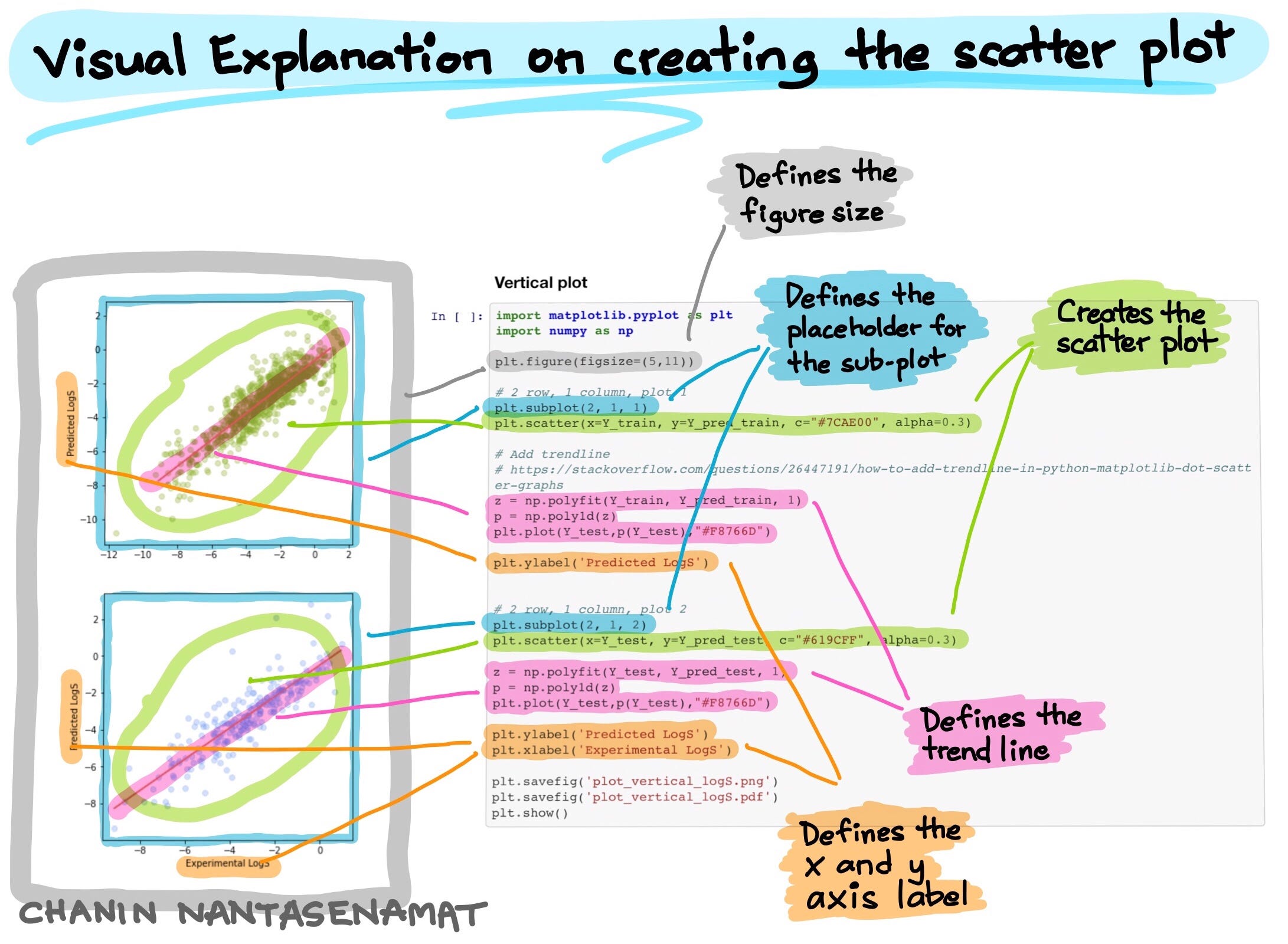
Visual explanation on creating a scatter plot. Here we color highlight the specific lines of code and their corresponding plot component. (Drawn by Chanin Nantasenamat)
Need Your Feedback
As an educator, I love to hear how I can improve my contents. Please let me know in the comments whether:
the visual illustration is helpful for understanding how the code works,
the visual illustration is redundant and not necessary, OR whether
the visual illustration complements the text-based explanation to help understand how the code works.